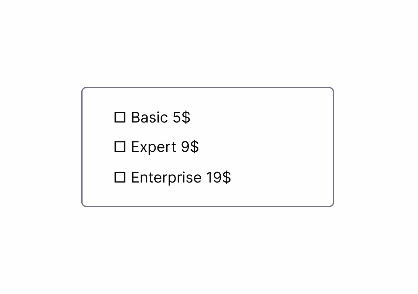
How to Apply
- Map the user journey and remove nonessential steps
- Combine or prefill fields
- Show clear progress
- offer exit/undo actions, so users can complete tasks quickly and recover from mistakes.
Compare dark patterns with bright patterns and learn how to apply ethical alternatives.
Adds unnecessary steps or barriers.
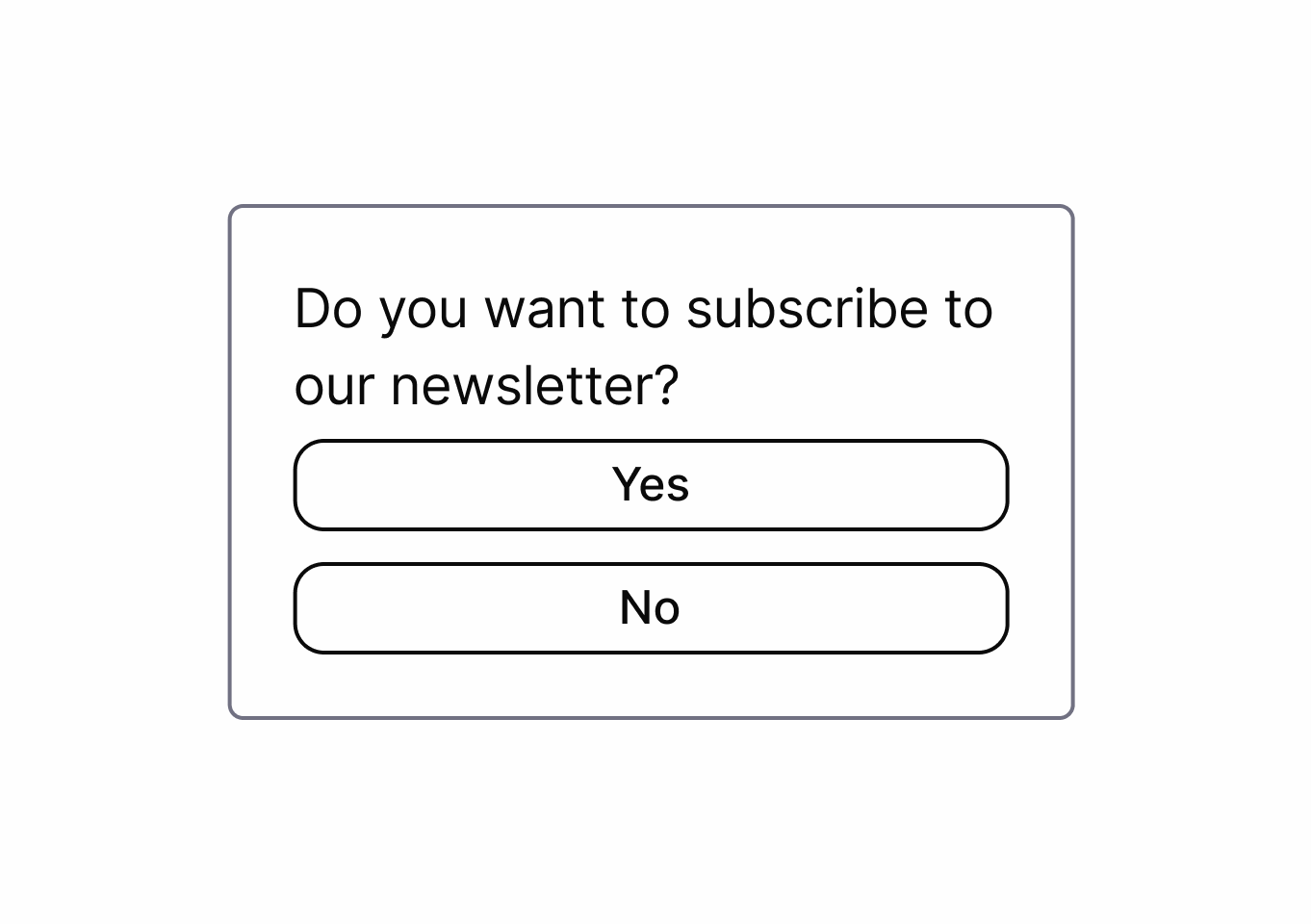
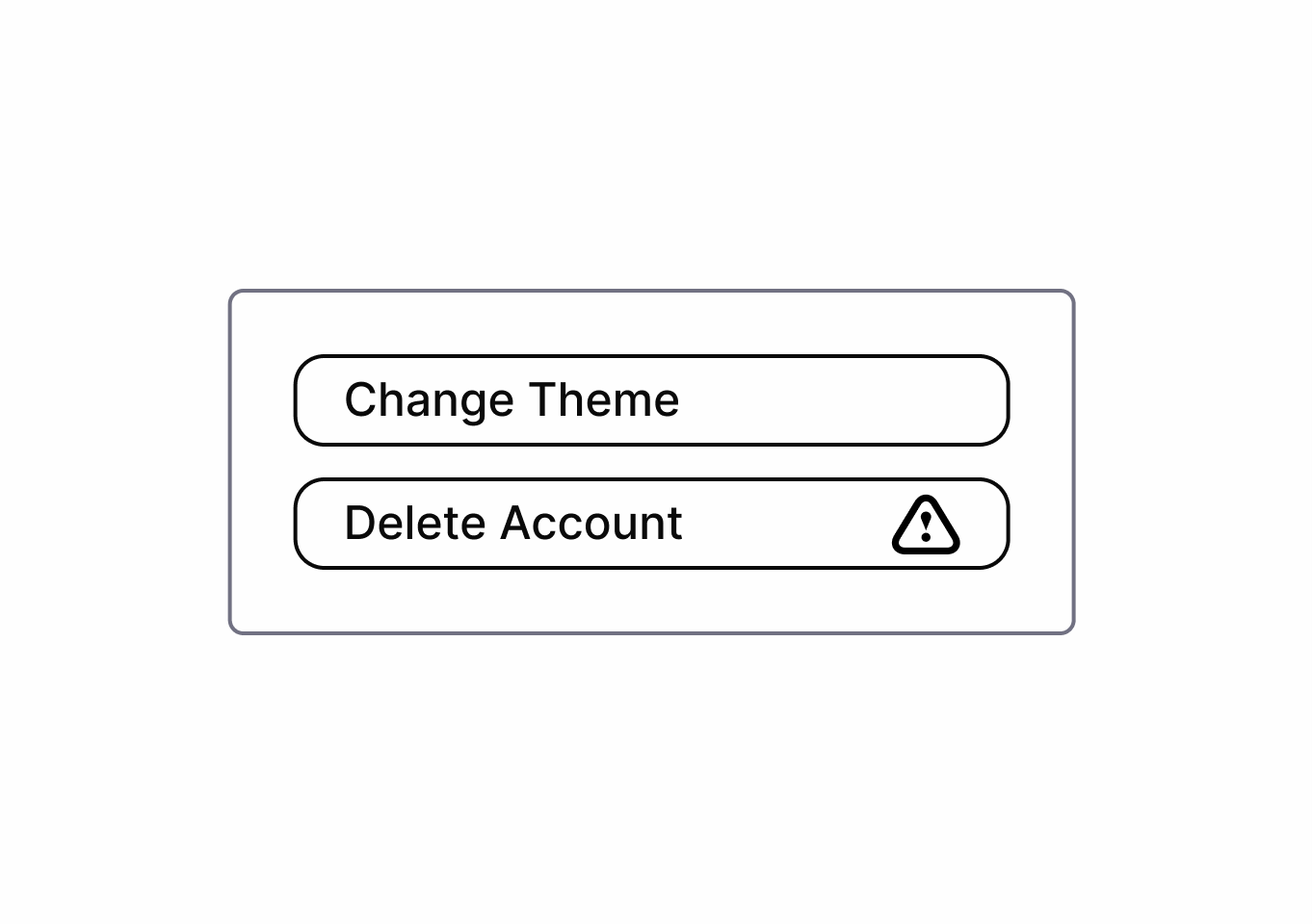
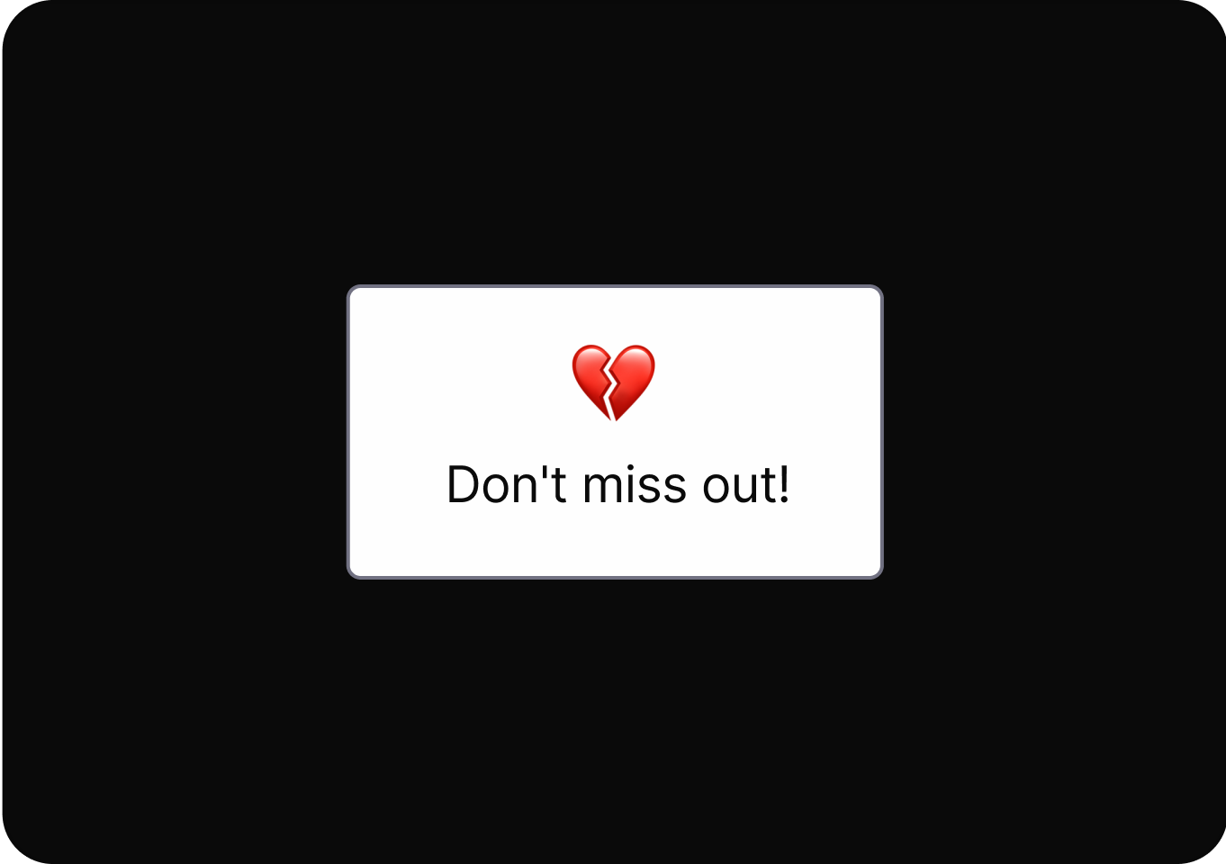
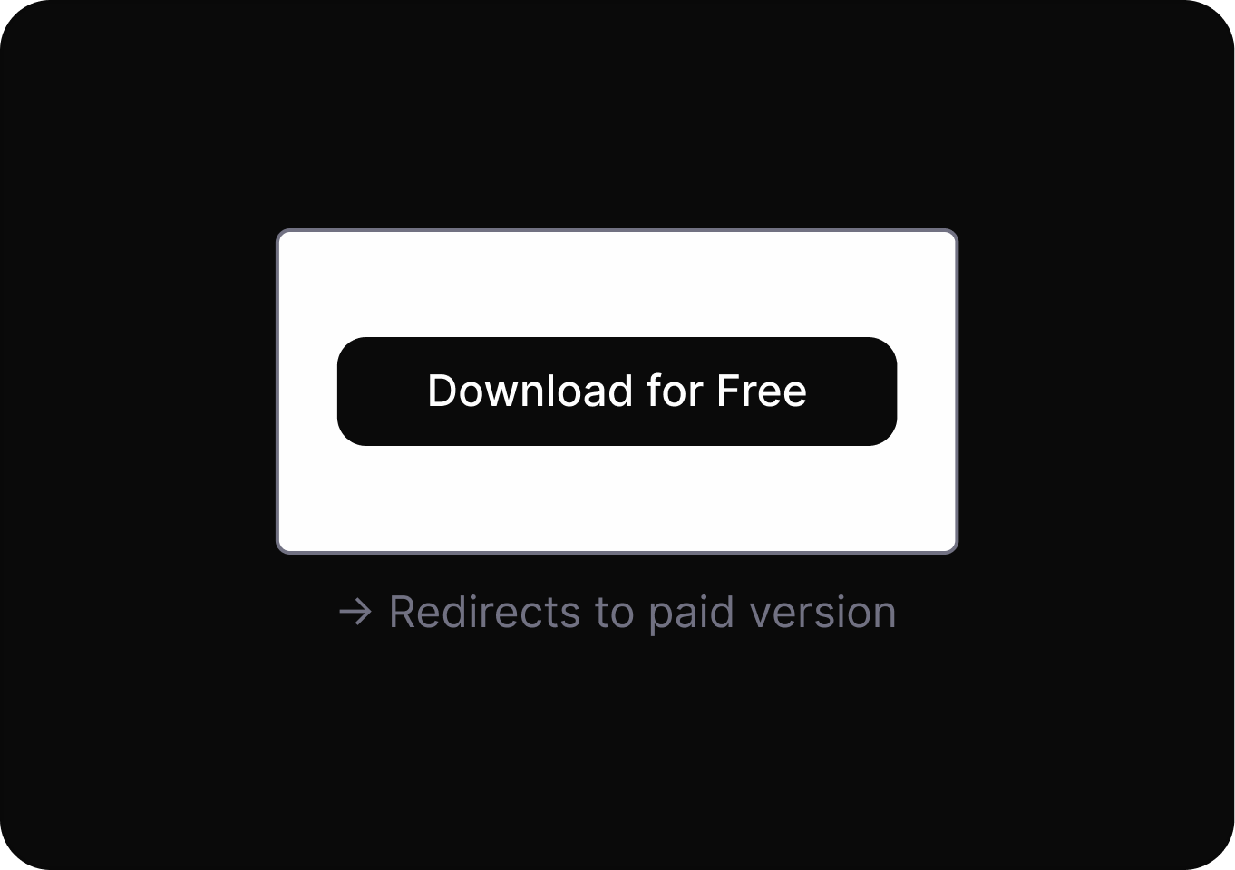
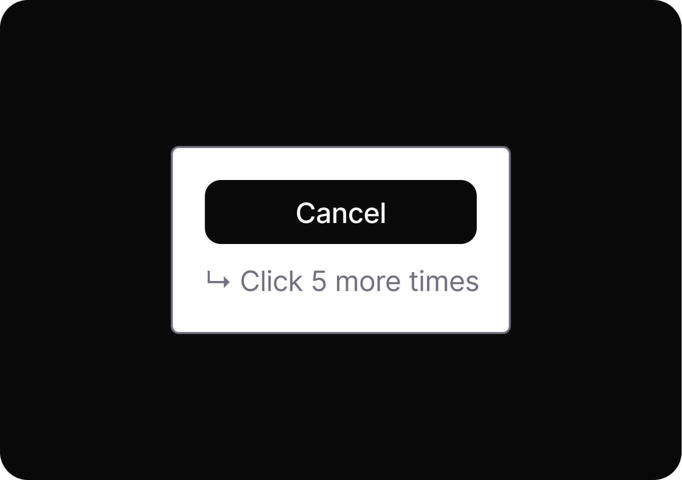
Starting an action is easy, but leaving or reversing it is difficult.
Deliberately complicating or restricting certain actions.
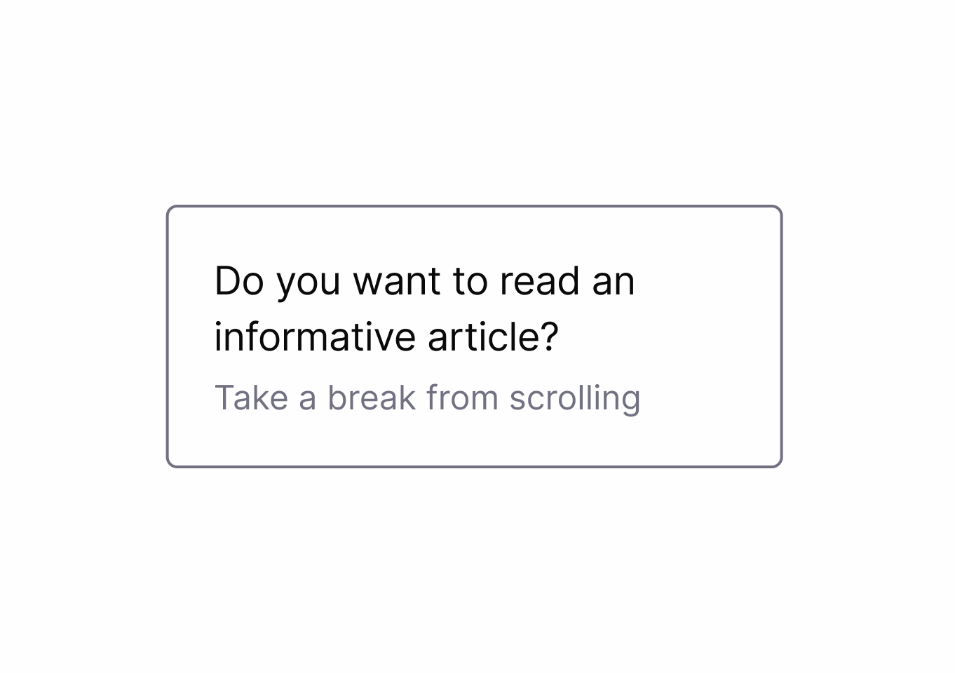
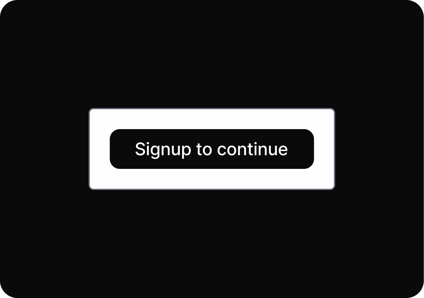
Requires users to complete extra, unnecessary interactions before finishing a task.
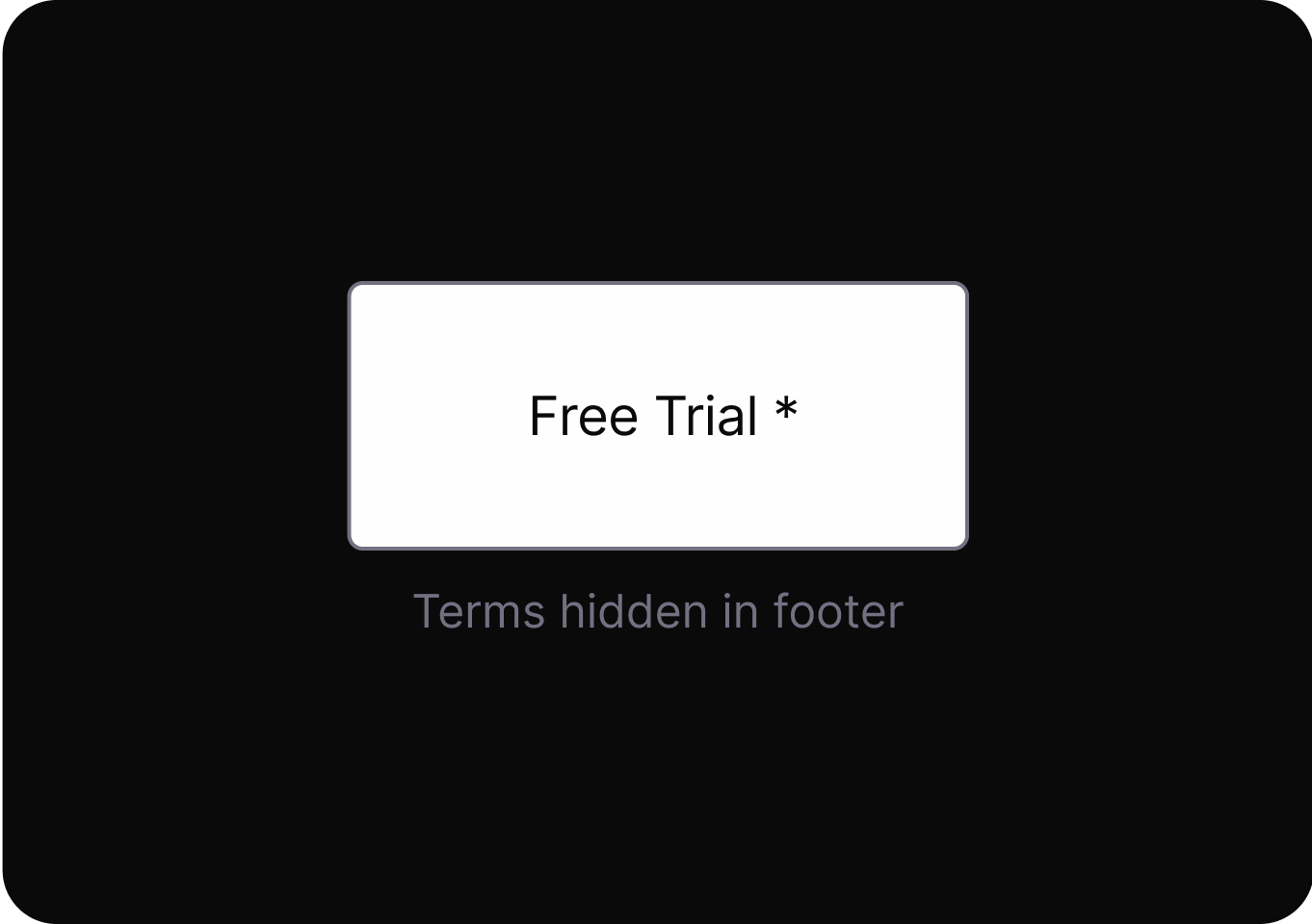
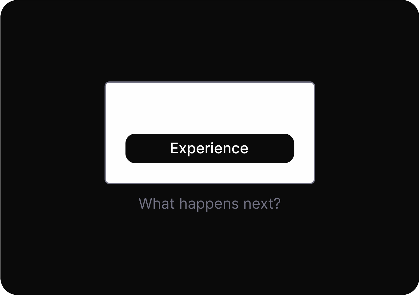
Hides or delays revealing crucial information.
It misleads users into taking an action by promising a desirable result, but delivers an unexpected, less favorable outcome.
Withholds or delays key details, making it harder for users to make fully informed decisions during their interaction.
Information is presented in a way that confuses users or hides relevant details, making informed choices difficult.
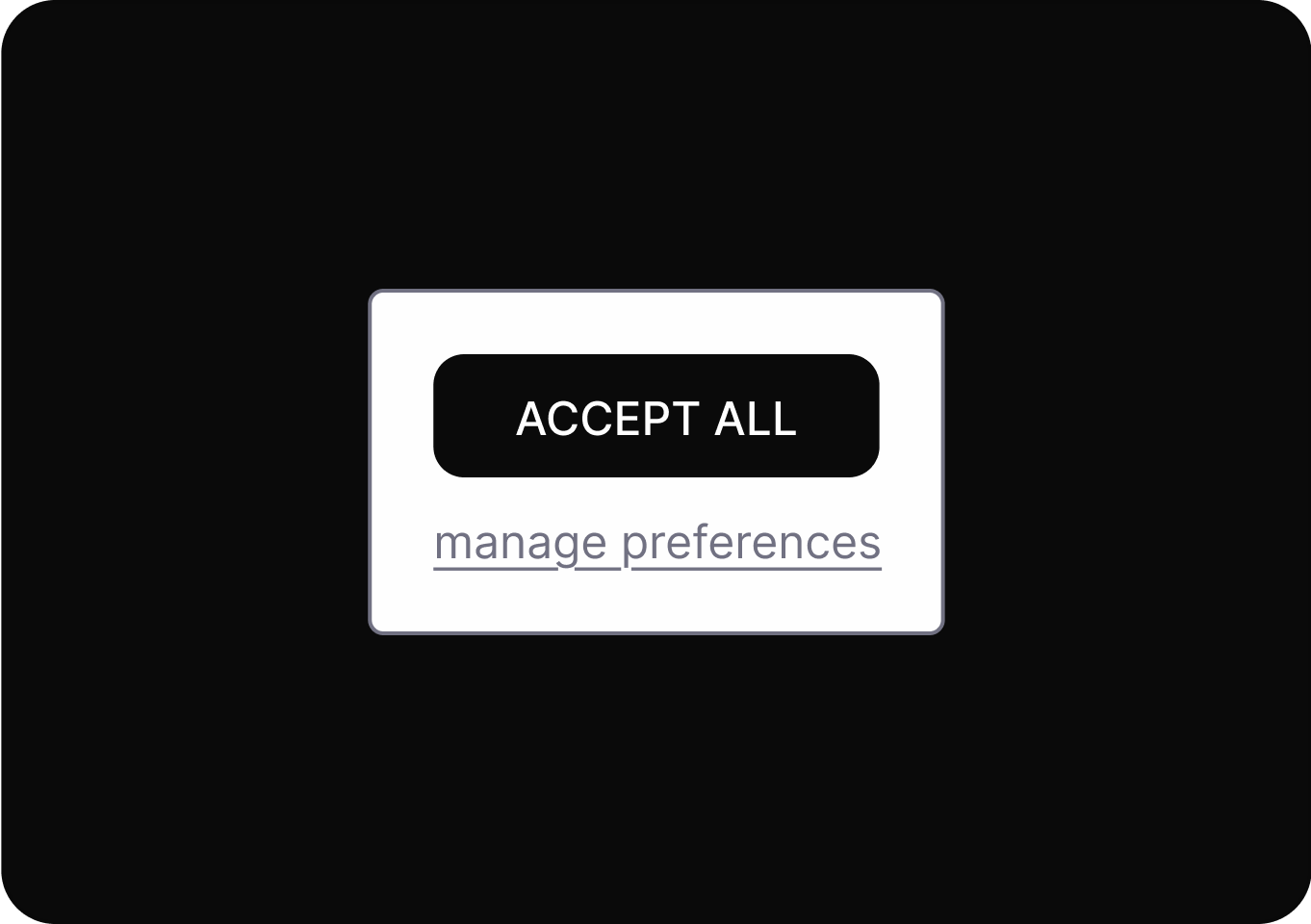
Make certain actions easier to find or perform while confusing or hiding alternatives.
Arranges or highlights options to steer users toward a particular outcome, often making alternative choices less visible or appealing.
Default settings are configured to favor the service provider, often exposing users to risks or unwanted actions unless manually changed.
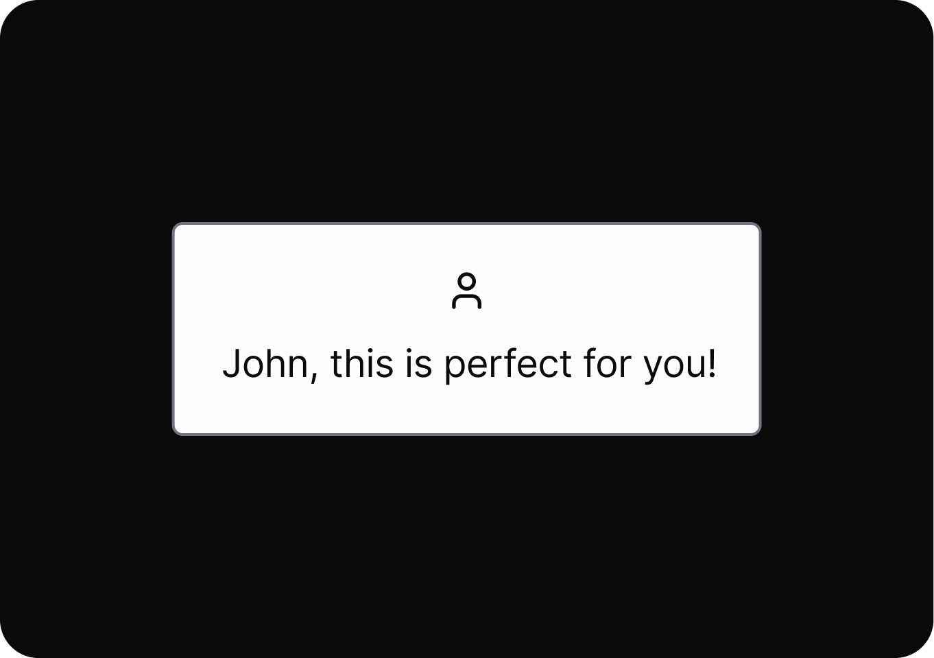
Design elements are intentionally altered to trigger emotions or sensory responses that steer users toward a desired action.
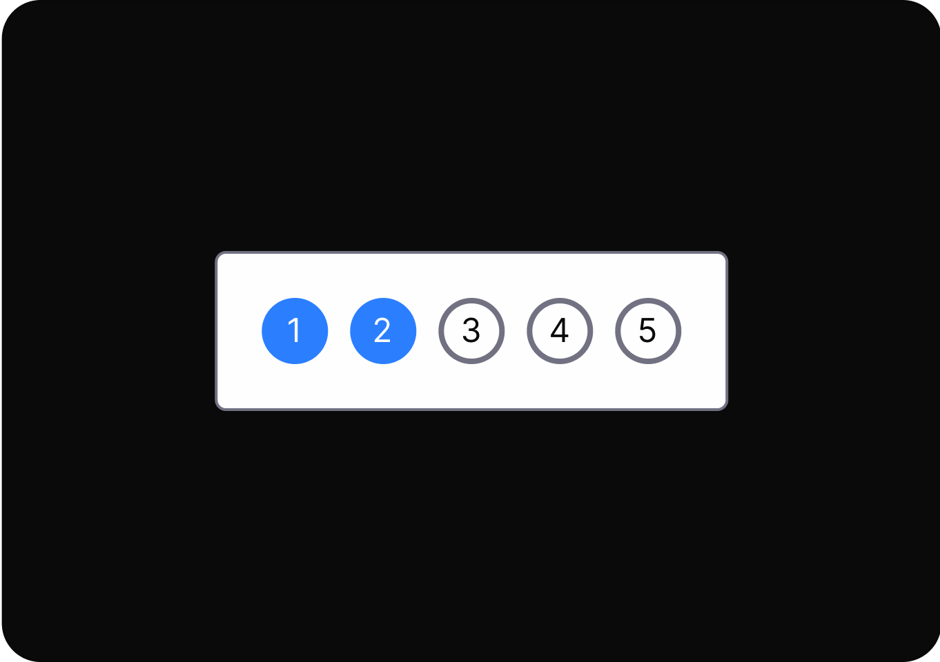
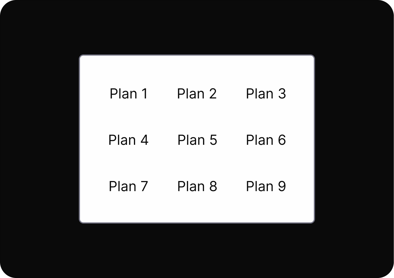
Presenting an excessive number of options can overwhelm users, leading to indecision, dissatisfaction, or regret.
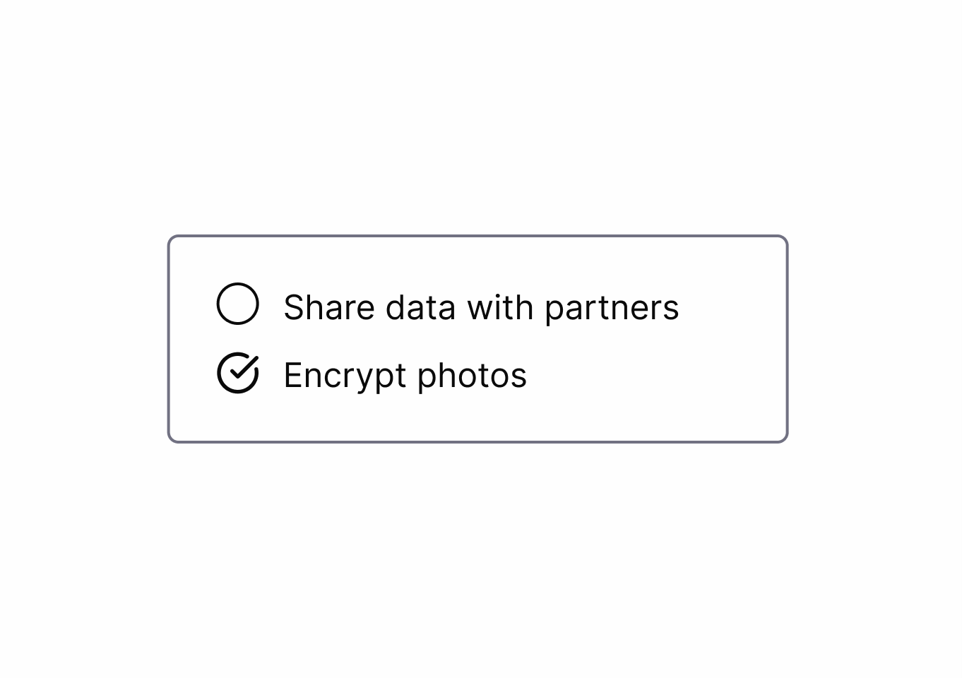
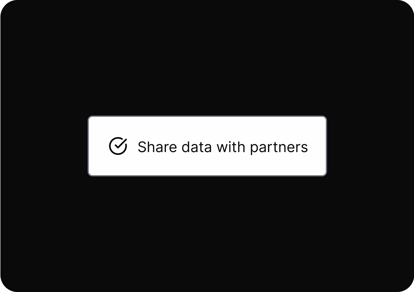
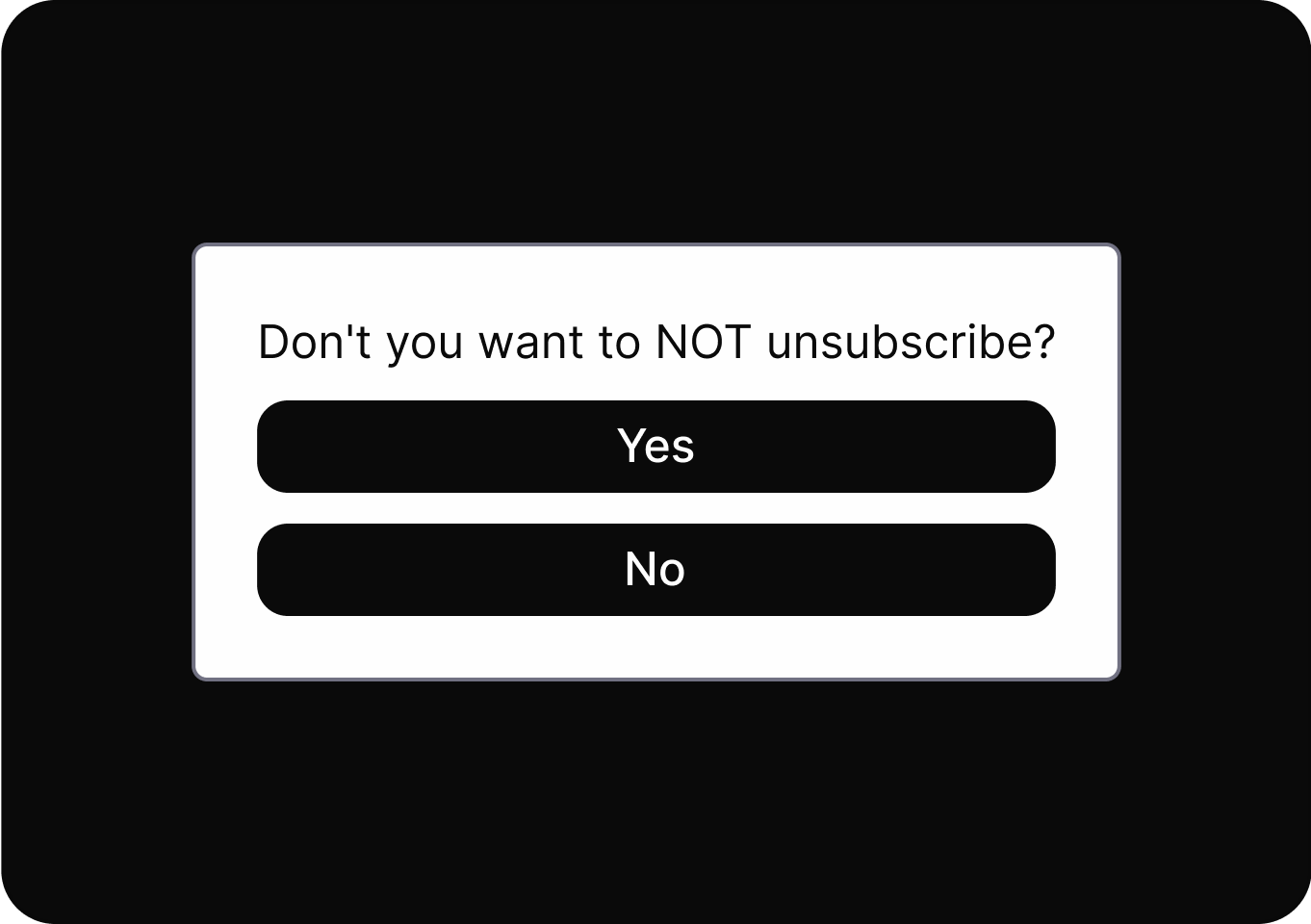
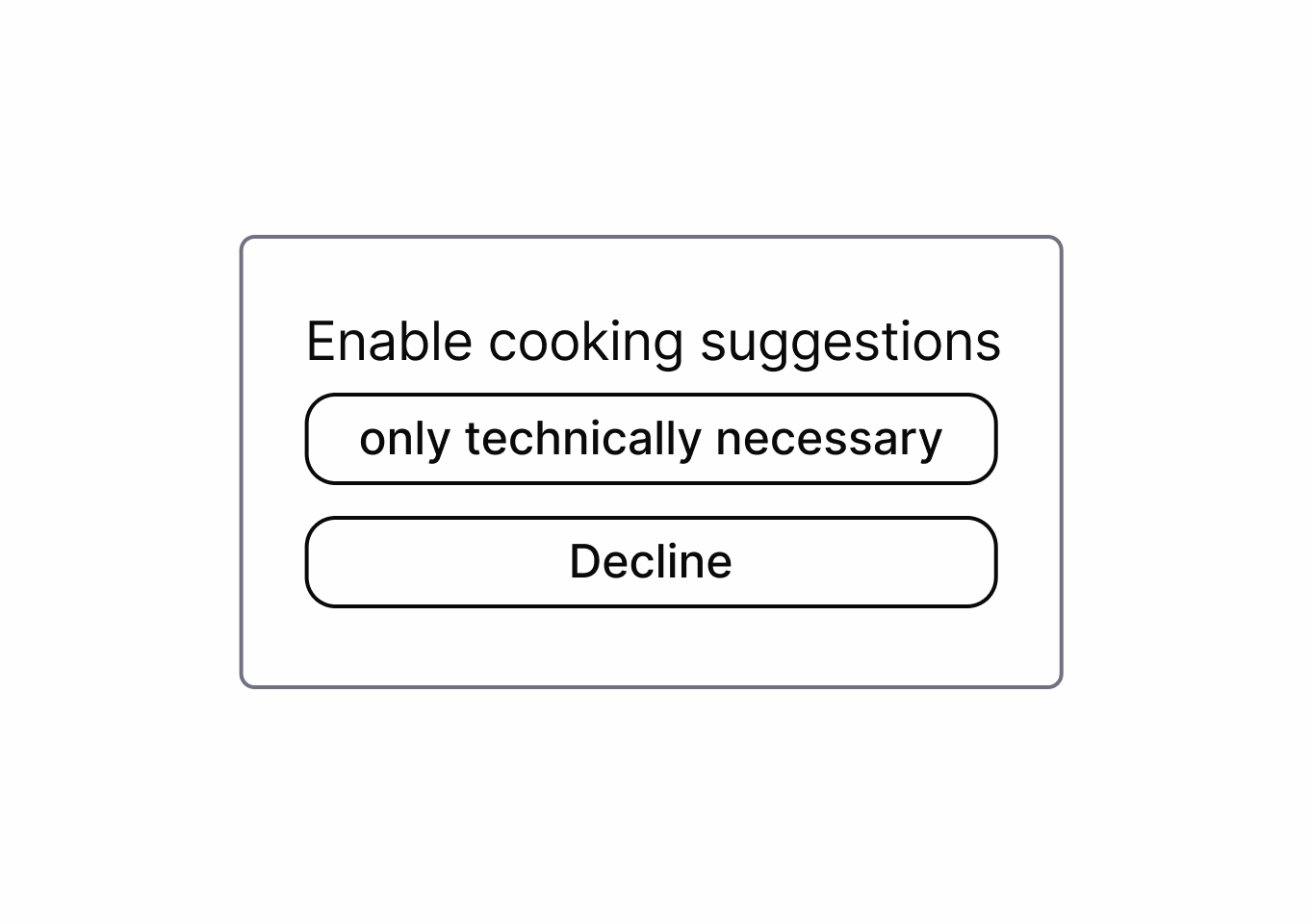
Uses confusing or misleading language to prompt users into making unintended or undesired choices.
Relevant details or options are concealed or presented as unimportant, making it harder for users to access or recognize them.
It creates a mismatch between the information given and the actions available, leading users to outcomes they did not anticipate.
It uses overly complex or unfamiliar language to make instructions hard to understand, reducing informed user decisions.
Require an unrelated step before an action
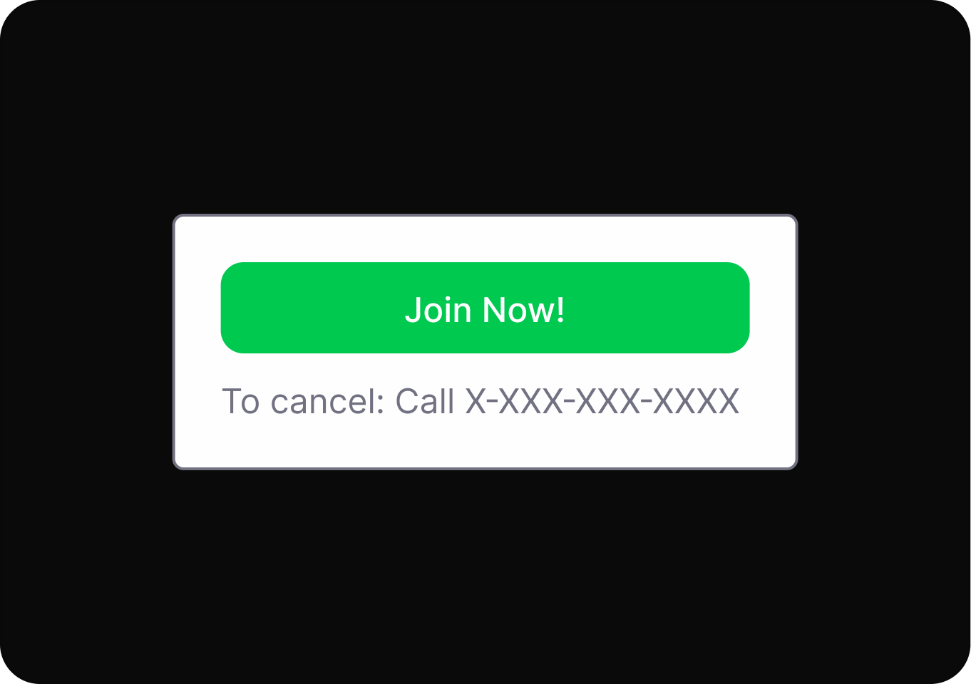
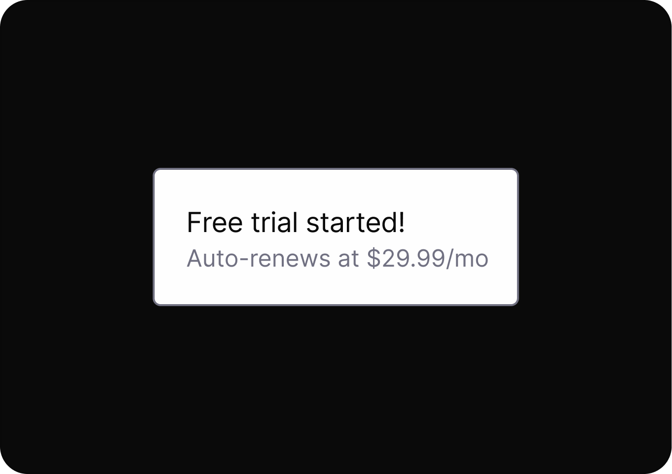
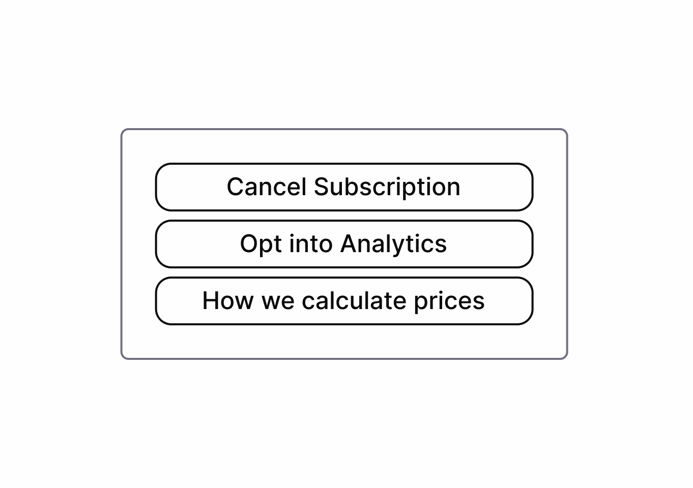
Users are automatically charged for ongoing subscriptions after trials end, often without clear notice or easy cancellation.
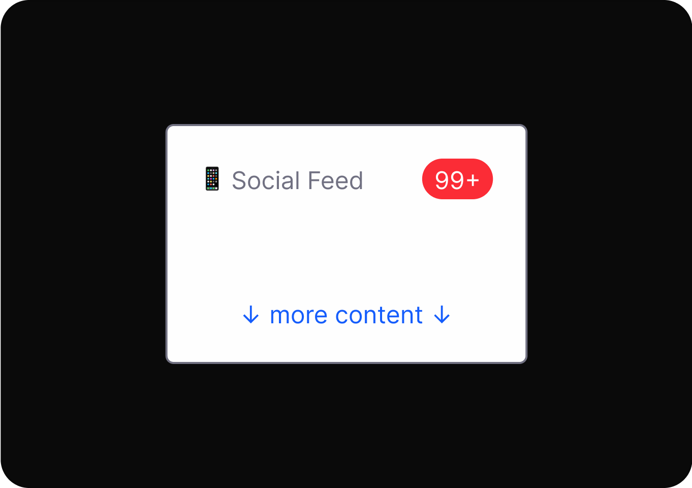
Designs use psychological triggers and interface tricks to keep users engaged longer than they intended, reducing their sense of control.
Repeated interruptions distract users from their intended tasks, pressuring them to take unwanted actions or make decisions.
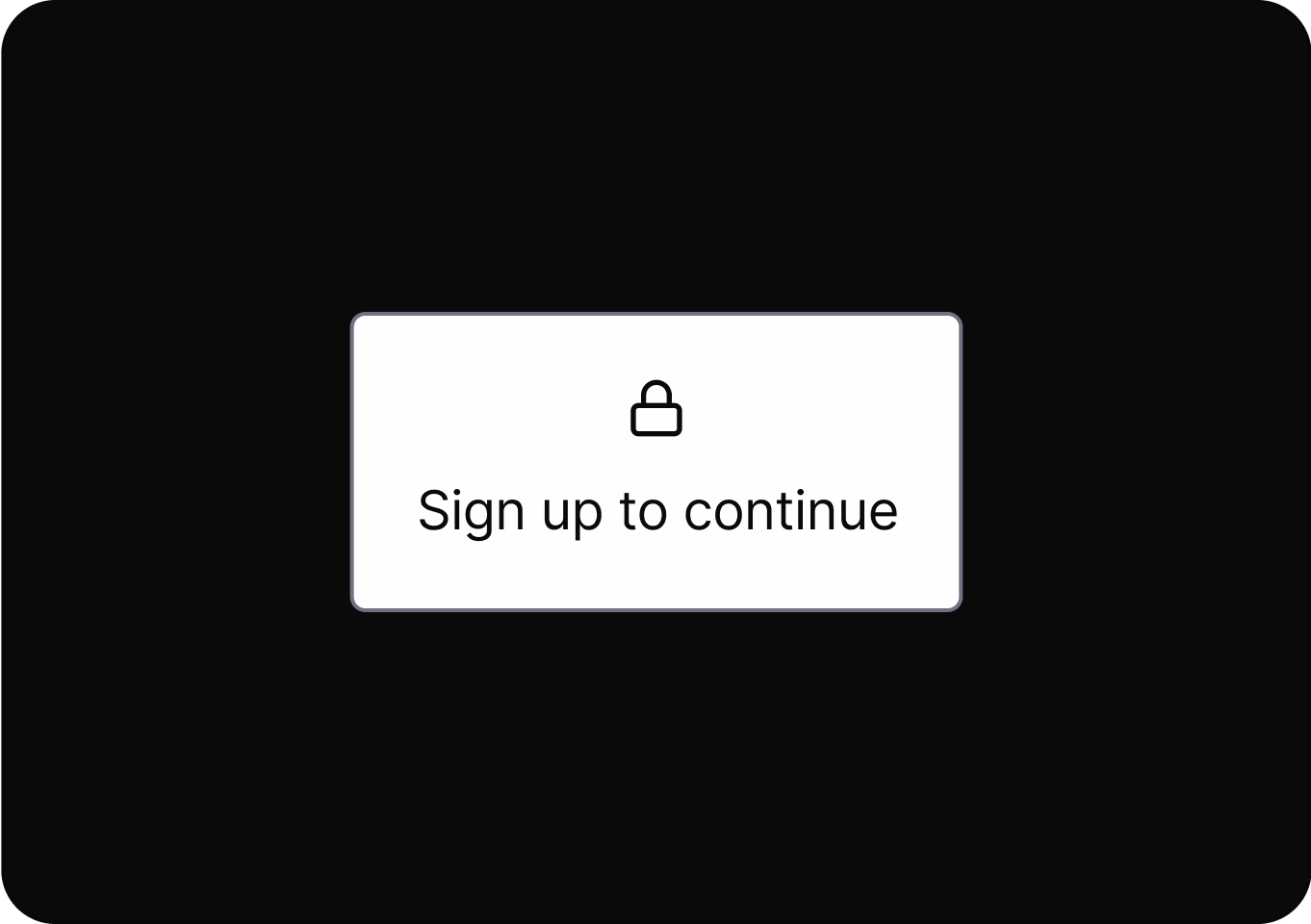
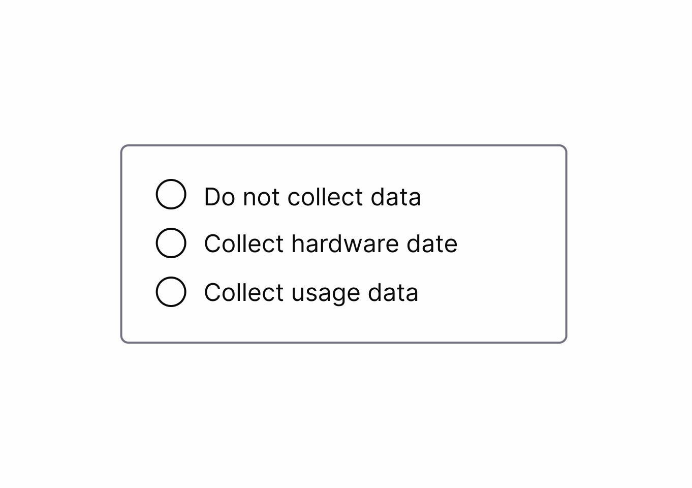
Users are required to provide personal information before accessing certain features, increasing data collection and lead generation.
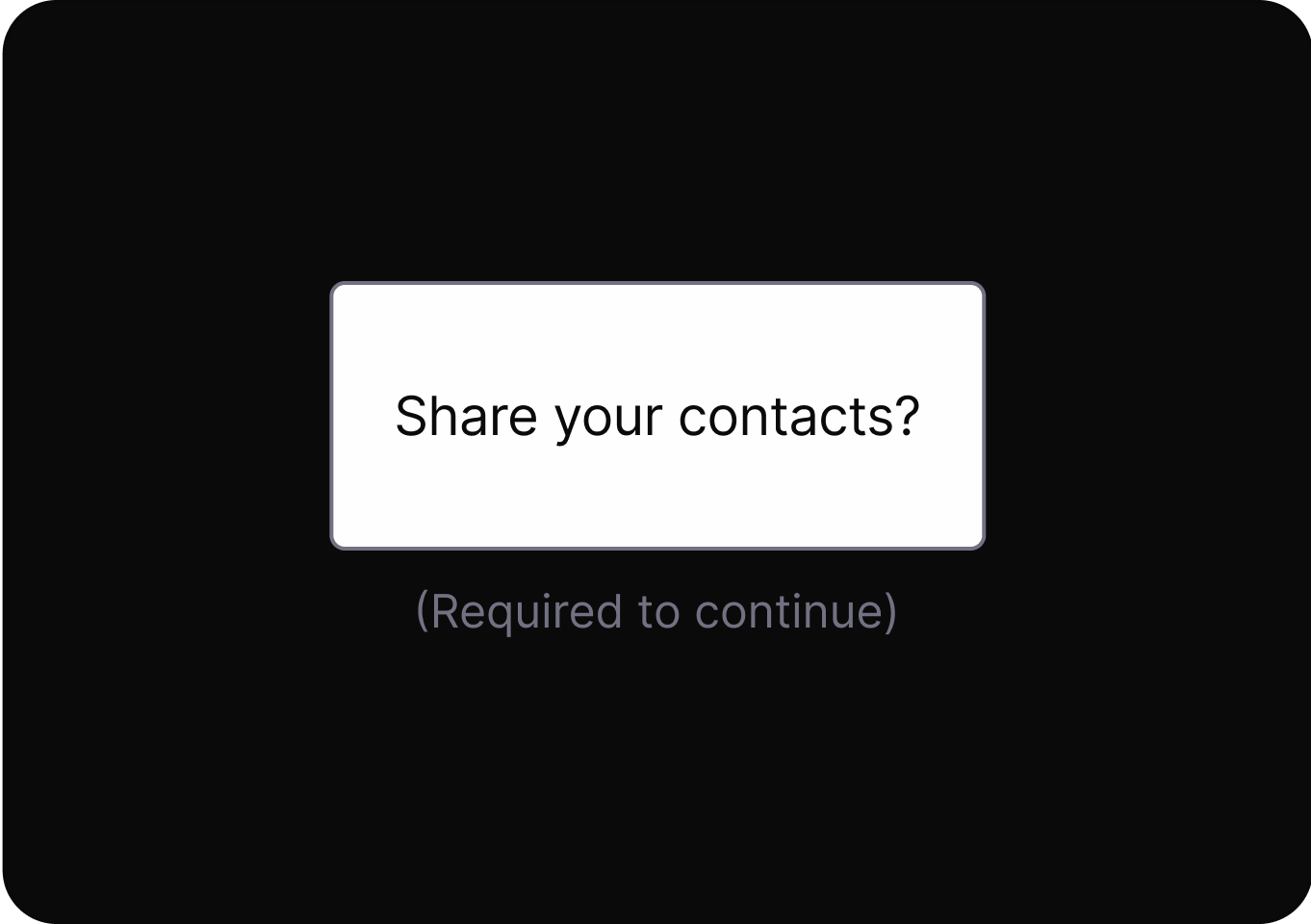
Users are manipulated into providing more personal information than necessary or having their data used for unintended purposes.
It uses rewards, points, or progress mechanics to drive repeated engagement, often encouraging actions beyond user intent.
Exploit cognitive biases to increase the likelihood of a desired action.
It pressures users to buy quickly by presenting products as highly sought-after or in limited supply, increasing urgency and perceived value.
It accelerates user decisions by prompting immediate action through time-sensitive or limited availability cues.
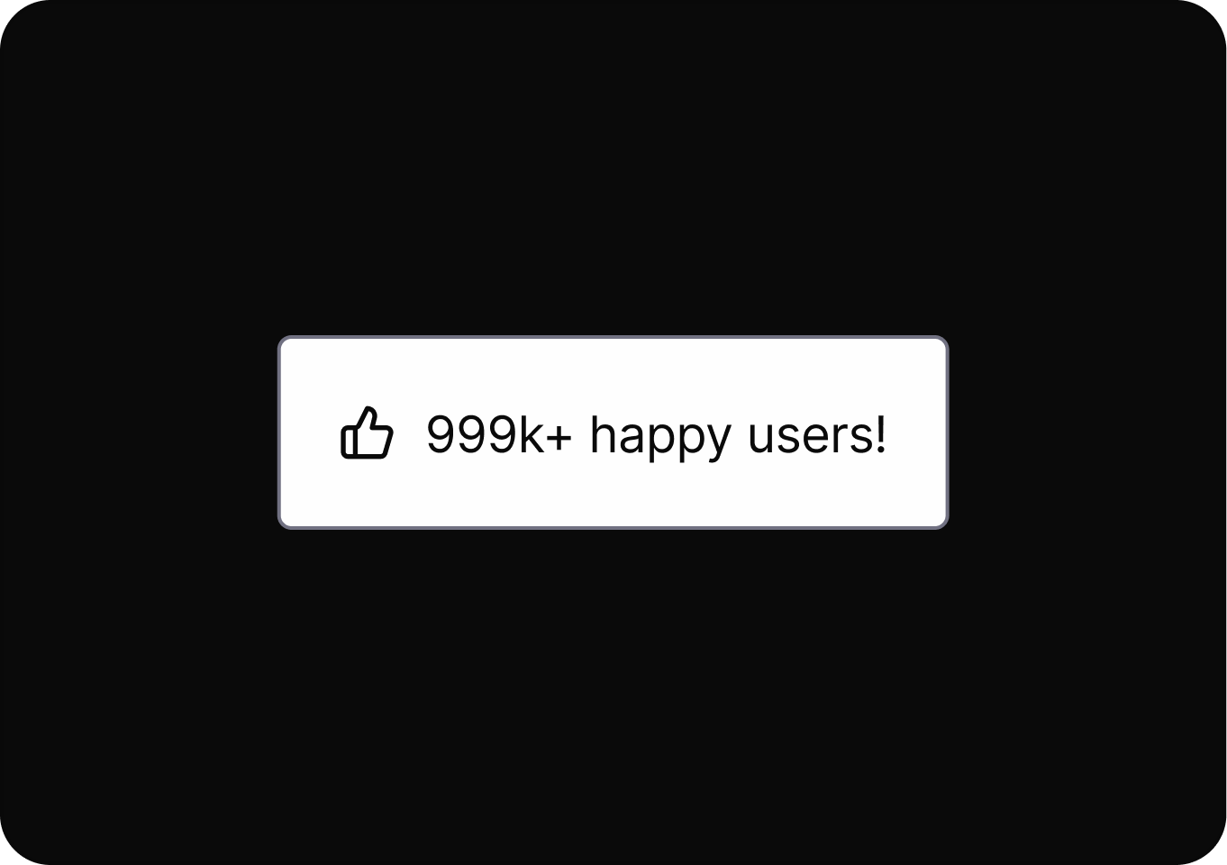
Influences people to quickly follow others’ behaviors or choices, often leading to decisions based on perceived group consensus.
Uses emotional pressure to make users feel guilty or inadequate if they do not choose a specific option.
It uses personal data to shape user experiences, influencing choices and hiding alternatives to guide user behavior.
Deliberately complicating or restricting certain actions.
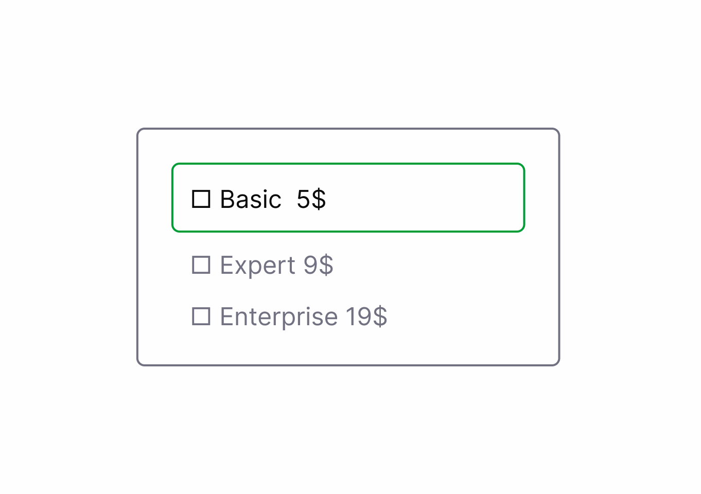
Keep processes as simple and short as possible for the user.
Information is presented in a way that confuses users or hides relevant details, making informed choices difficult.
contextualizing Cues.DrftjXAS.png)
Design options with simple, clear language so users know exactly what each action will do.
It pressures users to buy quickly by presenting products as highly sought-after or in limited supply, increasing urgency and perceived value.

Avoid using deceptive urgency or fake scarcity messages to pressure user decisions.
It accelerates user decisions by prompting immediate action through time-sensitive or limited availability cues.
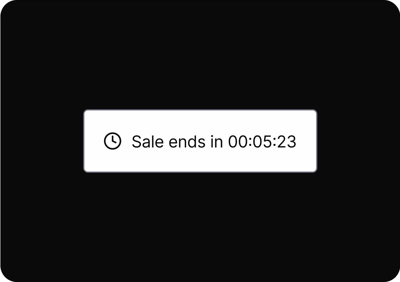
Avoid using deceptive urgency or fake scarcity messages to pressure user decisions.
Influences people to quickly follow others’ behaviors or choices, often leading to decisions based on perceived group consensus.
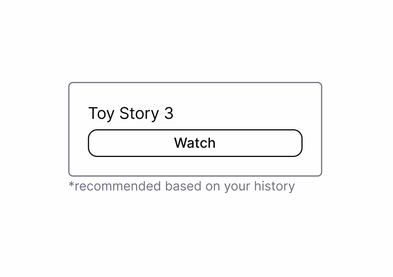
Reveals the logic and criteria behind recommendations to users.
Uses emotional pressure to make users feel guilty or inadequate if they do not choose a specific option.
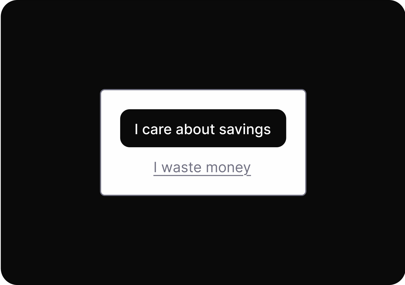
Presents choices with neutral, respectful language that doesn't shame users for declining options or services.
It uses personal data to shape user experiences, influencing choices and hiding alternatives to guide user behavior.
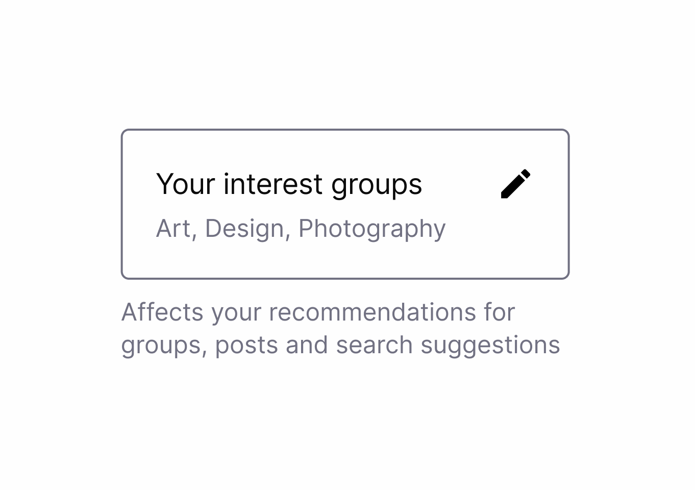
Transparently shows users how they are categorized and profiled by the system.
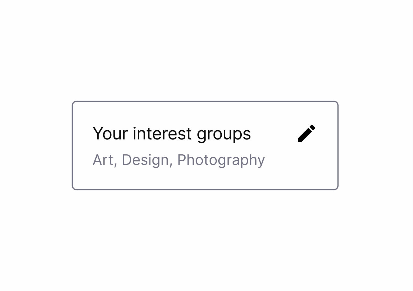
It uses personal data to shape user experiences, influencing choices and hiding alternatives to guide user behavior.
Reveals the logic and criteria behind recommendations to users.
Starting an action is easy, but leaving or reversing it is difficult.
Keep processes as simple and short as possible for the user.
Withholds or delays key details, making it harder for users to make fully informed decisions during their interaction.

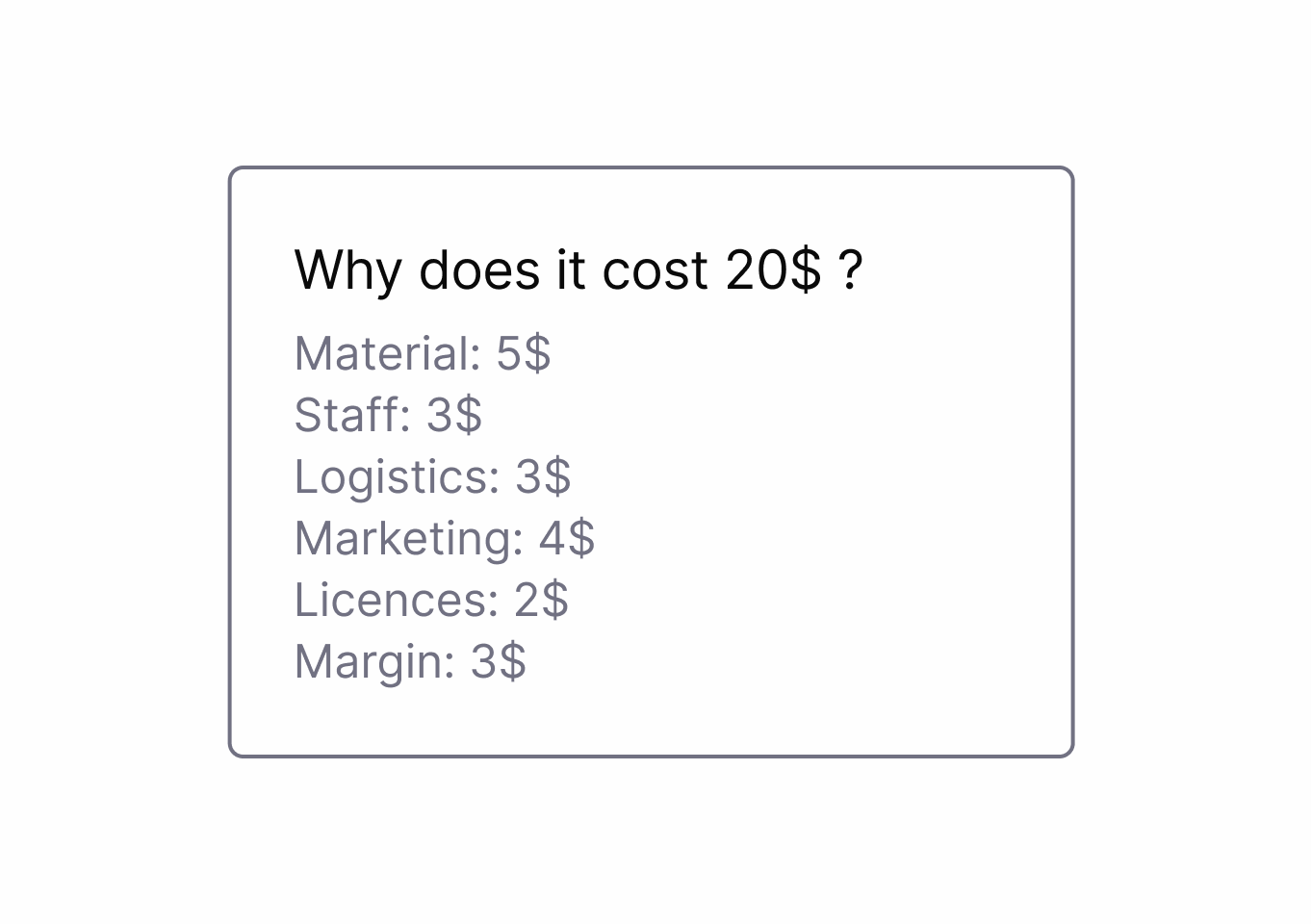
Shows detailed cost breakdowns respecting user curiosity and building trust.
Withholds or delays key details, making it harder for users to make fully informed decisions during their interaction.
Provides clear overviews of content impact or data usage similar to food nutrition labels.
Withholds or delays key details, making it harder for users to make fully informed decisions during their interaction.
Provides clear, transparent information about system processes, data usage, and decision-making logic.
Arranges or highlights options to steer users toward a particular outcome, often making alternative choices less visible or appealing.
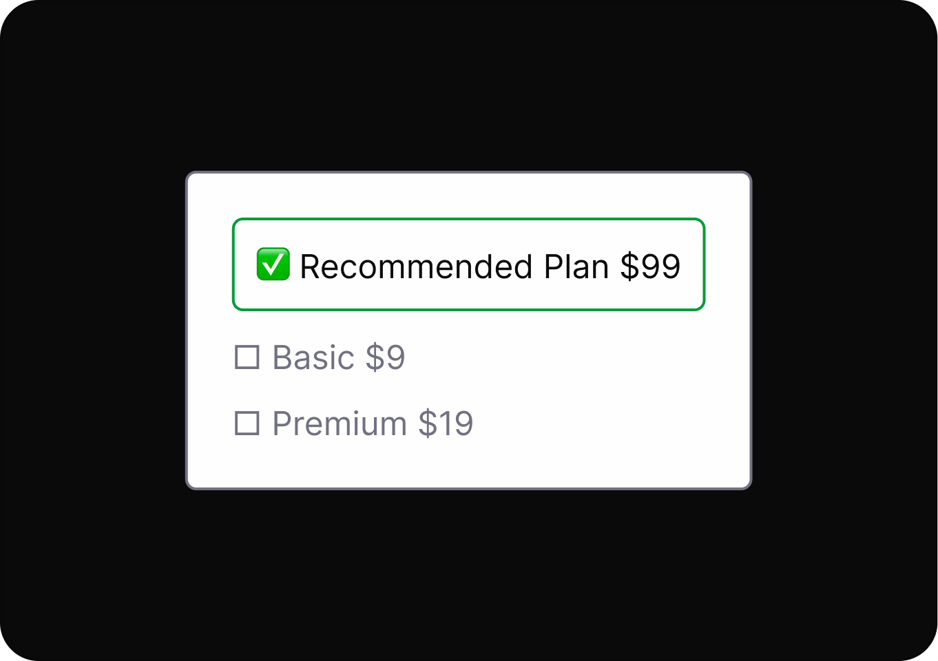
Arranges choices to place the most user-beneficial option at the top of the hierarchy.
Arranges or highlights options to steer users toward a particular outcome, often making alternative choices less visible or appealing.
Highlights and visually emphasizes user-friendly (beneficial) options instead of harmful ones.
Arranges or highlights options to steer users toward a particular outcome, often making alternative choices less visible or appealing.
Sets default options that benefit users rather than business interests.
Default settings are configured to favor the service provider, often exposing users to risks or unwanted actions unless manually changed.
Sets default options that benefit users rather than business interests.
Design elements are intentionally altered to trigger emotions or sensory responses that steer users toward a desired action.
Presents choices with neutral, respectful language that doesn't shame users for declining options or services.
Uses confusing or misleading language to prompt users into making unintended or undesired choices.
Design options with simple, clear language so users know exactly what each action will do.
Relevant details or options are concealed or presented as unimportant, making it harder for users to access or recognize them.
Provides clear, transparent information about system processes, data usage, and decision-making logic.
It creates a mismatch between the information given and the actions available, leading users to outcomes they did not anticipate.
Design options with simple, clear language so users know exactly what each action will do.
It uses overly complex or unfamiliar language to make instructions hard to understand, reducing informed user decisions.
Design options with simple, clear language so users know exactly what each action will do.
Users are automatically charged for ongoing subscriptions after trials end, often without clear notice or easy cancellation.
Design options with simple, clear language so users know exactly what each action will do.
Users are automatically charged for ongoing subscriptions after trials end, often without clear notice or easy cancellation.
Shows detailed cost breakdowns respecting user curiosity and building trust.
Designs use psychological triggers and interface tricks to keep users engaged longer than they intended, reducing their sense of control.
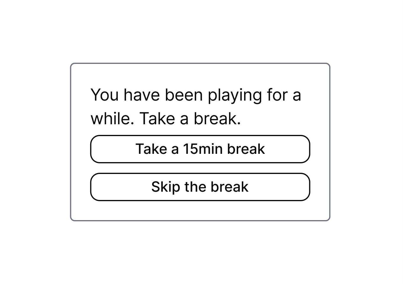
Limits usage time to healthy levels to promote digital well-being.
Designs use psychological triggers and interface tricks to keep users engaged longer than they intended, reducing their sense of control.
Suggests quality content that discourages mindless consumption while respecting user well-being.
Users are required to provide personal information before accessing certain features, increasing data collection and lead generation.
Design options with simple, clear language so users know exactly what each action will do.
Users are manipulated into providing more personal information than necessary or having their data used for unintended purposes.
Design options with simple, clear language so users know exactly what each action will do.
Users are manipulated into providing more personal information than necessary or having their data used for unintended purposes.
Minimizes data collection to only what is necessary with explicit user consent.
It uses rewards, points, or progress mechanics to drive repeated engagement, often encouraging actions beyond user intent.

Limits usage time to healthy levels to promote digital well-being.
It uses rewards, points, or progress mechanics to drive repeated engagement, often encouraging actions beyond user intent.
Presents choices with neutral, respectful language that doesn't shame users for declining options or services.
It misleads users into taking an action by promising a desirable result, but delivers an unexpected, less favorable outcome.
Design options with simple, clear language so users know exactly what each action will do.
Requires users to complete extra, unnecessary interactions before finishing a task.
Keep processes as simple and short as possible for the user.
Uses confusing or misleading language to prompt users into making unintended or undesired choices.
Provides clear, unambiguous consent mechanisms for data collection and use.
Exploit cognitive biases to increase the likelihood of a desired action.

Ensures ethical treatment of users through transparent practices and respect for user autonomy.
Adds unnecessary steps or barriers.
Keep processes as simple and short as possible for the user.
Hides or delays revealing crucial information.

Ensures ethical treatment of users through transparent practices and respect for user autonomy.
Make certain actions easier to find or perform while confusing or hiding alternatives.
Provides clear, transparent information about system processes, data usage, and decision-making logic.
Make certain actions easier to find or perform while confusing or hiding alternatives.
Ensures ethical treatment of users through transparent practices and respect for user autonomy.
Require an unrelated step before an action
Ensures ethical treatment of users through transparent practices and respect for user autonomy.
Presenting an excessive number of options can overwhelm users, leading to indecision, dissatisfaction, or regret.
Keep processes as simple and short as possible for the user.
Presenting an excessive number of options can overwhelm users, leading to indecision, dissatisfaction, or regret.
Design options with simple, clear language so users know exactly what each action will do.
Repeated interruptions distract users from their intended tasks, pressuring them to take unwanted actions or make decisions.
Keep processes as simple and short as possible for the user.
Two different approaches to Bright Patterns:
This approach is used by Sandhaus. It defines concrete Bright Patterns for specific contexts — for example the Bright Pattern "Usage Limits", which describes an interface that restricts the usage time of a service to a healthy level.
The original way the term "Bright Pattern" was introduced: the direction of the manipulation is switched from harming the user to being user-friendly. For example, instead of highlighting the option that harms the user, the user-friendly option is highlighted.
Source:
The symbiosis view connects dark patterns to bright alternatives
In the symbiosis view, each dark high/meso level pattern is paired with at least one matching bright pattern.
This view does not include low-level patterns, as these are implementation details. Refer to the related meso or high-level patterns for bright low-level alternatives.
Learn more about pattern levels in the pattern levels explainer.
Go into detail for each pair to see how a manipulative dark pattern can be replaced by an ethical bright pattern.
For that click on a pair in the symbiosis view to open its detail page. There you get a guide on how to apply the bright pattern and you can compare the bright pattern directly to the dark pattern.
A list of all sources used across the site. Click an entry to open the full reference.